YouTube Hottest Women Turn Off Channel Playlists
Time to follow the lead of YouTube’s hottest women. They may be pretty and popular, but they’re not stupid.
If you have enabled playlists on your YouTube channel, turn them off immediately. Many popular YouTube creators (especially the hot women) have discovered this already — or never bothered creating and offering playlists. Disabling the playlists is the only way to make it easy for a viewer to sort your videos on their own.
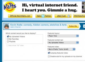
Go immediately to your account page, select “edit” under the banner… then uncheck playlists.
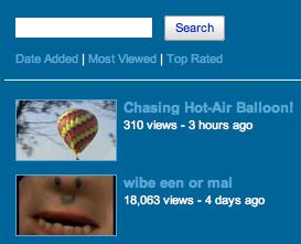
Only if you disable playlists will the user have the ability to instantly sort videos by various attributes like “dated added,” “most viewed” or “top rated” (per image below).
But if you show off your playlists, it takes a rocket scientist to figure out how to sort your videos by any criteria. So they may see that “best of” collection you assembled, but they’ll never find your recent videos. Or they may see your recent videos but not find your best videos. And they may not even find the search field.
Until YouTube solves this (and some of the other major UI flaws) in channel pages, you’re going to have to trust the user to sort by “most viewed” or “top rated” if they are trying to find out if you’re any good (“most recent” is top by default), because the playlist functionality is hostile.
Also- if “most recent” videos aren’t first, your subscribers won’t want to return to your channel page to catch up, because the new ones are too hard to find.
 I hope this helps. I’m puzzled why this isn’t solved by the technical folks, or communicated to people via YouTube. I went back to the original channel-page design for this very reason, and was really frustrated by the design.
For the record, I was working on a client project that required me to grab sample videos from prominent and attractive YouTube partners (iJustine, HappySlip, VenetianPrincess, HotForWords, CommunityChannel) and I saw that they’d all disabled playlists. What? You don’t believe it was a client project? You think I’m just cruising the list of the most-popular and prettiest girls on YouTube? You pig!
P.S. Like the new theme on this WordPress blog? I learned about it from Chris Brogan, and bought it immediately. It’s all SEO optimized, and was so easy to set up I did it without Jan’s help! It’s called THESIS and you can buy it here.


Why do I suspect this will soon surpass my blog post about “How to Get Popular on YouTube Without Any Talent”?
What’s really annoying is when NEWS channels have several videos at the top of the list of videos. That forces the user to look past these videos to find the newest videos. Correct me if I’m wrong, but I believe that news is about stuff that’s new! As I recall, ABC news is guilty of this transgression!
I don’t know, I think if someone is smart enough to know how to click on most viewed to look for most viewed videos from someone, they’re smart enough to click on the “Uploads” tab to find those options there still.
I’m going to have to side against this one… I have a best of for each year I’ve been on YouTube and I have every video on a series playlist.
It’s caused a lot of people to go into my archives that wouldn’t have and they tend to tinker around in my back catalogue because where “related videos” would normally be, the series playlist displays. It shows the videos that came out around the time of the one they are on now and it shows them in chronological order. I can say that it has definitely caused a lot of bouncing around in my older content – which I want. I want people seeing that old stuff as it shows how far I have come and shows them I am constantly evolving.
I continuously feature my latest video on my channel, as well as keep a playlist that goes newest video first entitled “The Peter Coffin Video Series” at the top of the playlist window (for lack of a better word).
It may sound confusing in explanation, but in practice it is quite simple and working out very well, as evidenced by a lot more engagement popping up on older videos.
Playlists or not, what really pissed me off is the way videos automatically start playing on some people’s channel page. Then there is some random video playing while I’m trying to read the profile or glance over the top videos.
The new theme is OK. The little avatars are cute (what do you guys think of mine?) but overall the layout is pretty plain and generic looking.
I hope you Naltsify it up a bit. It just doesn’t feel the same without the banner declaring your propensity for blatant self-promotion. (Wait…the banner suddenly showed up again, and it’s a slightly different one I think. The color scheme just changed too. I like the colorful orange better.)
Alexis- you can actually turn that annoying thing off. I did for a while. You know what- I’m going to fix that now…. turn that damned autoplay off.
Last I heard (this was several months ago), views don’t count for autoplayed videos.
@6 Really? How do I make it so people’s videos don’t automatically play when I visit their channel page?
I can’t figure out how to do it and I’ve tried looking at the YouTube help forums to no avail.
I’m pretty sure the owner of the channel can disable the autoplay on his/her own page, but I’m not sure if it’s possible to override the schmucks who do want their videos to autoplay. (No offense intended to said schmucks…OK maybe just a little.)
Does anybody know how to do this (or if it is even possible)?
Horrible new blog theme. So orange, so ridiculous!
Don’t even get me started on this new layout lol
Sadly, the cheese is gone, replaced by a ham sammich.
oh and I meant youtube, not yours 🙂 I like the new theme!
Alexis’s icon pic creeps me out. It’s very phallic.
Thesis is powerful, Nalts, but you’ve only skimmed the surface. And like everyone has said the interface presented here today needs some work. Your banner appears to come after the header area, instead of within it (it should ideally appear between the navigation and subscribe button). You can also flip the navigation to appear beneath the header section (if that looks better). Perhaps change the background colo(u)r to something darker. Lose some of the borders that make Thesis at times look so boxy.
Check out the Thesis Openhook wordpress plugin to help tweak your setup.
@13 Phallic? How does it look phallic? Sheesh, get your mind out of the gutter.
With regards to the layout, the blog looks nice and spacious on my 24″ wide screen monitor but the two side columns (were there two before?) make it just a tad cramped when viewed on a small screen. Make of that what you will.
Alexis… I realize my mind is in the gutter, but still… it creeps me out.
@14
See Kevin THIS is what I’m talking about 😉
I’ve been wondering about this myself, seeing how most people won’t take the time to figure stuff out if it isn’t apparent at first glance. And why should they? It’s the job of the designer to make things simple; this from a web designer.
@8 If you use Firefox, you can download Flashblock, which stop all flash on a page from playing and replace it with a white box with an arrow until you click on it to let it play.
https://addons.mozilla.org/en-US/firefox/addon/433
@17 I was rather fond of it, but maybe I’ll change it just for you. Stay tuned.
@20 Meh. I don’t use Firefox that often (usually Google Chrome).
NutCheese, is this pic less phallic looking? (You may have to clear your browser’s cache to see the new one.)
That one seems a little Christ-like.
@19 here here
@20 very nice! thanks
@23 Dang! Everyone’s a critic.
I’m switching to this one. The last one was too small.
Testes, testes, 1, 2, 3!
OMG! So you think I’m a Big, fat, green thing now Nalts!?
———————————————>>>>>>>
Un-F-ing believable!
Seesh!
I ended up doing the same thing with my playlists when I changed over to the new channel design. I keep hoping they’ll improve it, and make things more customizable and easier to use, but so far that’s been a total pipe dream.
@Justine – Do the channel layouts really matter? You have significantly more traffic to your channel than most of us. I don’t see much of my views coming from my channel, mainly related videos. Does that change with a large sub base or brand? Are more people (percentage-wise) just headed straight to youtube.com/ijustine?
@Zack – They definitely do count, as I got the video of that girl angry at my Twilight parody up to 2,200 views from featuring her video on my channel on autoplay. Which I may do again, I want her video to go viral. It’s hilarious. http://www.youtube.com/watch?v=wyuJnwX8HhM
I’m too lazy to create a new twitter account, but as far as Canadian tubers, you can’t forget davidsfarm. It’s great when you need your white-trash redneck fix.
http://www.youtube.com/user/davidsfarm?blend=1&ob=4
Yo, Nalts. Check this out:
http://www.huffingtonpost.com/2009/11/10/twitter-to-tv-shit-my-dad_n_352354.html
I know you’re a fan of this guy.
I just noticed KevinNalts.com got a make over too.
The FAQ page has no FAQs though and there seems to be some kind of error at the bottom of the main page:
Warning: include() [function.include]: Failed opening ‘../counter/count.php’ for inclusion…blah blah blah.
I had forgotten just how much this video of Kevin’s made (and still makes) me laugh (and not just because I’m mentioned in it)
http://www.youtube.com/watch?v=aXJVxmWTmkg
@33 I like it too. I alway knew you were the “homeless man in Texas” he was referring to.
My claim to fame 🙂