Would You Trust YOUR Brand to UGC? I Did and It Worked!
Would you trust your corporate or personal brand to strangers via UGC (user generated content)? I don’t mean the “conversations,” but the actual logo of the brand. Well I did, and it paid off!
I made a video and tweeted last month inviting people to submit NaltsConsulting logos (offered a $100 prize for the winner), and was thrilled to receive about 160 treatments from about 120 people. While some were so humorously horrible I’m tempted to use them, many were remarkably professional. I have no doubt that one of these will be the winner, and I probably could live with a few dozen of them.
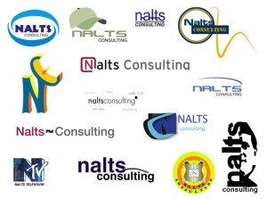
Click below to see a few random ones I grabbed to show the range, or even better… go to Flickr and comment on any of the entries!
If you submitted a logo and it’s not among them, two things might have happened. I might have not seen your note (searched all gmail for attachments and the word logo). About 5-10 were in formats I couldn’t recognize or upload to Flickr. So please let me know via kevin nalts at g mail (no spaces). And if you have a last-minute concept, please send by August 9, 2009. I’d like to get this settled next week. Thanks for your patience– this project went on ice for a few weeks because my dad passed away.
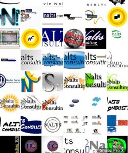
Here is a complete collection of the logos. Like any in particular? If you’re logged into Flickr you can comment. I’ll probably reflect on it (and would appreciate your input), then pick maybe 5-10 finalists and ask video viewers to vote.
Again- thanks so much to those of you who took the time to do this — a lot of these were done by kids as young as 10-14! You’re a talented group!


As the self proclaimed designer of Nalts: http://designer.ofnalts.com, I would like to nominate the “baseball cap” logo as the top listing so far. I am saddened to see that my logo did not make the cut however. 🙁
Ok, gave my $.02! There were some really nice ones! I’m impressed. Good job contributors!!!
I want a logo now, just so I can feel important…lol.
Davey, try posting a link here of your submission.
the one with the hat is absolutely the best. Do that one.
The hat is the best of the bunch. There were a few other decent ones but none that were really great (but maybe I’m too picky).
I think you should consider running a logo contest at Worth1000 if you want a really professional looking logo. Check it out!
A litho version of your thumbnail would be the best. Immediately recognizable and funny.
wow, there are some really nice ones, hard to choose.
But now I’m sorry I didn’t enter the ones I made of you with hair, er I mean more hair – not for the cash, but just for the giggles. click2c
that gives me an idea…
Try this
http://www.logomaker.com/
^ that was fun!
click
I like the logo with the butt plug.
I like the hat. Suits you. And I think it might help people remember who you are.
The hat logo is the best
The hat logo is good, but the lettering needs kerning in NALTS – move the L and T closer together and add the space to the other letter-pair spacings.
Butt plug? I didn’t see any butt plug. Besides, I thought your trademark was hair plugs – not butt plugs.
Nalts, if you ever develop ED – we do NOT want to hear about it. I’m just saying…
sorry to hear about your dad nalts..
i just read about that
Nalts – I Love how you are using the power of online video to continue and build your own brand awareness. And plus it’s just fun to see what you’re up to!!
I like the split-face one.
I prefer the one with the hat. …yeah… that one is pretty cool.
Looks like the hat logo is by far the favorite.
You Hat Logo is my choice as well
the purple one at the bottom that says NC. not the one with the black background though. i LOVE it.
i also like the hat one. but i didn’t want to say what everyone else has.
I love them all, but I think the one with the hat is the best. 🙂