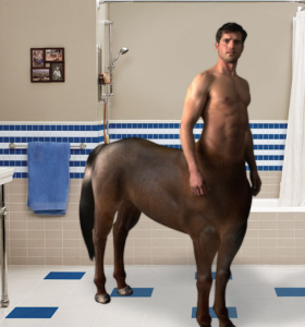
Creepy Old Spice Video Ad Wins “Worst Video Ad of 2008” Award
 A Pegasus-like horse-plus-man guy is hanging out in the shower talking about how he’s two things at once. It’s a creepy video ad, topped only by a creepier website that loops his voice.
I present you with the “double-impact” campaign for Old Spice’s Red Zone Body Wash Moisturizer. It’s based on the laziest marketing proposition ever: Trying to distinguish a product as being “two things in once” is like launching a car that appeals to “emotion and logic.” We haven’t heard that before.
It’s not unique, ownable or differentiating, and it’s made worse by the painfully dull and awkward creative… Not funny, somewhat disgusting, and memorable only in how freaky it is.
We give it the “WillVideoforFood Worst Video Campaign of 2008″ award. I dare you to top it. Old Spice would have been better off maintaining its positioning as your grandfather’s deodorant.
And you have to love that the URL from the ad (which caught my eye on The Onion)…
http://www.oldspice.com/doubleimpact/?banneractuallyworked
That says a lot about the agency’s confidence in its banner redirect technology, doesn’t it? I dare the agency responsible for this to raise its hand. Anyone? Anyone?

OMFG, that is creepy, disturbing and bizarre. Did you watch the tank one? He has a cannon where every man would like to have one. And it moves around. And fires.
How ironic. An ad campaign for body wash that stinks up the place. Must’ve been created by a vlogger.
it’s a tough call the Microsoft web site was pretty aweful, I think we might have a tie here.
Does anyone really use Old Spice, I thought that was for old men.
I’d ride him!
hm…
old spice should’ve made one where it covered up farts. or not. Y’ALL ARE A BAD INFLUENCE ON ME! clean it up, do it for the kids.
jesus christ, that thing was just chock full o’ sexual innuendos. Took too long to watch though.
WifeofGarage and I were just talking about how creepy that ad is…
That horse is a mare, btw.
What they can make cannon innuendos, but they can’t make a centaur that’s anatomically correct?
Follow me on Twitter.
My vote for worst advertising ever in history would be that DREADFUL Mr. Opportunity for Honda or whatever. Ugh, I cannot STAND Mr. Opportunity!
For the record, I do use Old Spice…
Bring on the jokes, everybody. I never knew that it was embarrassing.
Do you guys remember that franchise sandwich shop advertising campaign where they used a wet, deformed sewer rat as the mascot / spokes-rat?
That’s my pick. The whole company must’ve been high to run that series of ads.
@ mdj — Oh, my God, yeah… Quizno’s (link)… about 4-5 years ago… Utterly twisted… The one thing about both them AND the Old Spice campaign, not to mention the annoying local used-car dealer who’s al over TV, is that even though the ads were atrocious, repulsive, or downright creepy, here we all are, talking about ’em.
I tell my clients that if consumers love your ads, or hate ’em, either way, that’s better then apathy — the emotional tune-out. One key to an effective ad is that it makes the consumer feel something.
The other key to an effective ad is that it makes the consumer want to buy your s***. The Quizno’s ads at least were curious and remarkable, if a little weird. However, the Old Spice ads just make me feel kinda yucky, which will likely lead to me buying a different product to feel clean.
Watching 13,000 YouTube videos must’ve desensitized me to ugly, slater, because now that I look at your link, those rat-things don’t seem as disgusting as I remembered. Might even consider putting one between two slices of toasted bread and taking a bite.