Confused By the YouTube Player Interface?
Just back from vacation, and confused about your new YouTube player? Well you’re not alone.
Here’s the new look and feel, and new functionality. The most profound change was the shift from 5 stars to the “thumbs up, thumbs down.” That’s a smart move, given that the majority of raters gave it 5 stars, followed by 1 star. Basically people love it or hate it.
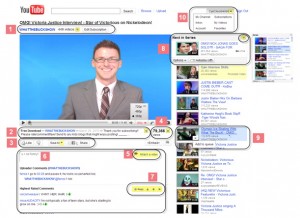
Courtesy of the YouTube help page, here’s the new design. Ever notice how Michael Buckley is smattered all over YouTube’s help section and appears in 74% of the sample screen shots? Someone loves their WhatTheBuck show over there.
Now a key code of the sections, with my editorial:
(1) Username , Subscribe button, and “More from User” (easy way to identify creator and unsubscribe)
(2) Video description (+ tags etc.) (easier to miss this now, but it’s there)
(3) Ratings, Favorites / Playlists, and Share options (much more attention to playlists, and hopefully will induce sharing)
(4) Data and Statistics from Insight (bet you didn’t know you can spy on other people’s “insight” data now)
(5) Video Response (for the 5 people who use this)
(6) Video Comments (what the hell happened to “view all comments”? Grrrrr).
(7) Respond, rate, and flag comments (and you can instantly see all the videos you thumbed up).
(8) Next in series / Up Next Queue (nice way to hook viewer)
(9) Add to Queue (new version of Quicklist) (of course who goes back to queue?)
(10) Account options


You got hit next under the comments to go the second page before the Show All Comments link appears. So stupid.
Oh, and I did know you can view the data and statistics. That’s not even new.
Comments are harder for me to negotiate now.
I’m getting use to the changes, but I still do not like the comment layout and getting to the quick list and history takes more effort.
I don’t know why they changed things, you tube finally worked and now they want to break it