Tag Archives: review

Idiot & Cheapskate’s Guide to Automating Your House (DIY SmartHome Hubs Controlled via Phone)

When I was a kid, I had this vision for my home that included automated everything — from lighting to blinds. Until last night, it was theoretical. Now I can turn off lamps from various rooms… from an Android or iPhone, even when I’m not in the house. It’s a start. And this morning when I got to work, I had the joy of toggling the lights from my phone to freak out WifeofNalts.

Let me warn you that we’re in an odd point of home-automation maturity. We’re moving beyond the era where it was reserved for the wealthy or techno elite. But it’s definitely not ready for prime time, and requires more patience and experimentation than I’d like… but such is the cost of being an early adopter, right?

My entry into “Smart Home Land” set me back only about $125: just $50 for a Wink hub (less if you buy it with add-ons) and about $75 for a bunch of GE Link lightbulbs (get the six pack). And I’ve got a plan for growing into additional functionality like remote monitors, appliance device on/off, security/alarms and broader control of lighting without doing the nightly sweep of 50 light switches. I can’t yet spring for the Nest, which is the connected thermostat that is the best-selling in its class. Honeywell and Lux fell asleep at the wheel.

Let me cut to wide shot and tell you about your options to entering “Smart Home Land.” Home automation was once reserved to the elite and wealthy, and required a special contractor and installation. Now you can pick up a hub and some $50-$150 add-ons and do-it-yourself quickly. I’m not going to get into the really nerdy hacks, but there are plenty of forums that can teach you to customize these beyond what the manufacturers specify or even offer.

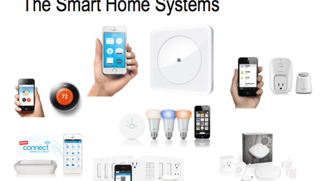
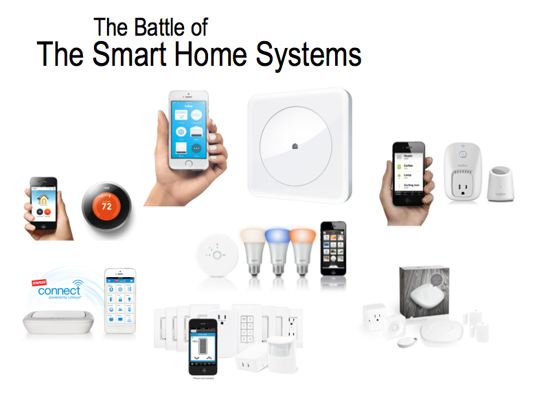
There are too many options and a shake-down is looming. There’s Belkin Wemo, Phillips Hue, Quirky Wink, GE Link, Staples Connect, Harmony, Insteon, Lutron, Revolv, Smart Things. Overwhelmed yet? Here’s a review of some of them if you want to get into the weeds.

Let’s cut to your basic entry options, and then I’ll tell you why I started with the cheap, flawed but Swiss Army Knife option called Wink… note that I’m favoring options that don’t require ugly remotes or special displays. We’ll use our iPhones and Androids, thank you very much.

Which smart-home system offers the best flexibility at the best price?
  1. Belkin has a Wemo switch that is a best-seller on Amazon and an easy place to dabble since it’s only $40. It uses your wifi and allows you to control any appliance via your Android/iPhone (just plug appliance into the Wemo, and the Wemo into your outlet. You can add on lots of additional options via Amazon or Home Depot. And if you’re all about lighting, you can get a Belkin Wemo starter kit for $85 that comes with a little hub and two lights… nice dorm room gift for that college techno kid. But I don’t see Wemo as a serious player.
  2. Then there are the lighting-specific solutions: Phillips answer to lighting customization: the Phillips Hue, which comes with a ton of different lighting options. The starter kit will set you back $188 and the individual lights get pretty expensive. Phillips Hue is generally cost-prohibitive except for those elite wealthy who might as well higher a contractor. But Home Depot has a decent spread of expensive lights so I imagine Phillips will be a formidable player. For those without excessive cash, the GE Links are better (you can also get these at Home Depot).
  3. There are a few other hubs that I didn’t look at closely. A cool-looking Revolv smart-home automation system (now part of Nest, the Google thermostat). Haven’t seen Revolv as a player yet. There’s Staples Connect (with Linksys), which is decent player and one that will likely survive the consolidation because Linksys and Staples are serious individual players. And the Smart Things Starter kit, which seems fairly comprehensive and has the best Amazon ratings… but is $300.
  4. And there are loads of home security devices, but I’m not writing about those.
  5. And the winner/wiener is… Wink hub despite some seriously negative reviews (including my own). Setup is torture (40 minutes of trial/error), but adding GE Link bulbs was as easy as screwing in bulbs and naming them. I can’t speak yet to the pain/joy of adding things beyond GE Link bulbs, but that alone made it worth the trivial entry cost of $50.


wink compatible products
Wink’s interface allows you to connect with a bunch of devices from other manufacturers

Wink is the buggy but poor-man’s Switzerland of all these home automation standards and devices. It has built-in support for Bluetooth LE, Wi-Fi, ZigBee, Z-Wave, Lutron ClearConnect, and Kidde. It also handles Phillips Hue (with some limitations) and works like a breeze with GE Link bulbs. I also like that Wink is a product of Quirky/GE, which gives inventors a chance to manufacturer ideas.

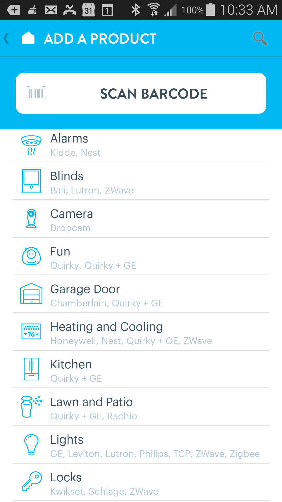
Once you have a hub and suffer through setup, you can add all kinds of things: alarms (Kidde/Nest), blinds (Bali/Lutron/ZWave), cameras (Dropcam), weird things from Quirky, garage doors (Chamberlain and Quirky/GE), heating and cooling (Honeywell, Nest, Zwave, Quirky/GE), lawn/patio, kitchen, door and window locks, and general appliances via a power plug that accommodates two different plugs that can be controlled separately (the other two are just plain extension plugs). Warning- that power plug got absolutely hosed on Amazon comments and it’s clearly flawed.

We’re still a few years before this stuff becomes more mainstream, but it’s nice that it’s become somewhat affordable and I like that you can experiment with different components to see what’s worthwhile.

Have you tried any of these? Would love your experience and “watch outs.”

New Artistic Community: The 5-Dollar Store of Fiverr

It used to be when I needed a graphic, song, voiceover, technology help… I’d have to beg and borrow. It was a lot of work, and often made me feel guilty (even though viewers have been awesome about creating assets for me).

Now I’ve discovered Fiverr. which is almost a black market of talented artists, designers, technologists, writers and those with even more interesting skills.

I’m not sure they’re unemployed, and maybe for most this is a hobby that makes money.

Already I’ve commissioned a new banner for the blog (see bottom of post), a goofy Odd Holidays jingle for videos I’m doing about odd holidays, a cartoonization of one of my photos, and a motion-text intro for The Unlicensed Therapist (a new web series I’m doing). I’m even getting a logo for that show… three of them precisely. Are the voicovers pro? Not necessarily, but certainly worth more than $5. Heck I even paid $5 for stress removal, but haven’t found out what’s coming yet.

For $5. Amazing, huh? I almost wish they had a slightly higher price point to attract even more talent and enhance scope of assignments. You can have photos of finger puppets holding your logo, or have your brand eaten by a pet. It’s a load of fun, and a brilliant way to help video creators get decent work for very little investment (which is important given the uncertainty that a web series will “take off”).

Here’s a teaser of “Your Unlicensed Therapist,” but this one is a bit flat. The others will be more edgy, and I’m now recruiting local YouTubers to be in an episode.

One of the three masthead/banners I got for $5 from Fiverr

YouTube’s Redesign (Cosmic Panda) Fails & Wins

cosmic panda logo picture drawing image
He's cute. You've got to admit that.

YouTube is about one month into its most significant design change since launch: Cosmic Panda. I have a feeling I know where they got the “cosmic” and the panda.” Let’s look at the redesign, and overthink what it might tell us about YouTube strategy, and what I believe works and sucks (wins/fails).

As with other redesigns, hardcore YouTubers squealed and the rest of you probably didn’t even notice. We see that across the Interweb with any major design change by a social-media site or publisher. Unlike previous changes focused on the YouTube “homepage,” however, I believe the essence of this redesign (not having read any Google statements) is three-fold:

  1. Simplified video player: The new design creates what Philip Defranco legitimately calls a “Hulu grey” surrounding a very purist player. The majority of the information (date, comments, view count and related videos) are now almost lost”below the fold,” which has negative and positive implications.
  2. Preparing for TV/Web Marge: Cosmic Panda appears to be providing a “lean back” experience resembling television, but not too deeply at the expense of a “lean forward” user-driven video session characterized by searches, views of a channel page, comments, selection to view playlist, fast-forward-like options while we view “playlists.” Playlists, by the way, are assembled by creators or users, and are given far more emphasis in Cosmic Panda.
  3. Major Channel Page Changes: There’s been an odd disconnect between viewing a video on a “channel” page (created by a network, show, vlogger, artist or advertiser) and a regular view you’d experience by finding a video in the typical manner. And Cosmic Panda seems to be bringing these experiences (views on channe page vs. regular “watch” page) closer together. In reality, only a VERY small percent of views take place within a channel page. We advertiser and creators too often forget this. So it’s interesting that Cosmic Panda put so much effort into overhauling the creator “channel” pages. I gather these changes were made to accommodate the complex needs of networks and producers, but in reality the “branding” options have almost entirely vanished.
What Do These Changes Suggest About YouTube Strategy? I have heard for months that YouTube would make more efforts to accommodate creators/networks so that, for instance, a single channel could accommodate multiple shows. I’ve also heard that the design would make it easier to curate videos and share them, which is very important. I believe we can make some important conclusions about YouTube based on this design:
  1. Above all, the user comes first. Like Google, simplicity trumps advertisers and content creators.
  2. This design does suggest to me that YouTube wants to move toward web-TV. I could actually envision binging on YouTube content via my Google TV using this new design (something that was not as easy or fun in the previous one).
  3. Most importantly, I believe the emphasis on the channel page is the most telling. The channel pages are not frequented relative to views OFF channel, yet this is YouTube’s second major design release that fundamentally changes these channel pages. One could gather that YouTube sees value in these (or else they’d leave them alone, or give channel owners what they wanted). They didn’t. They reduced customization of the channel pages, and that’s consistant with previous reductions of channel owners (who once were permitted a small banner besides every video). So what’s the plan, Stan? Are we going to see a greater emphasis on channel/TV-like consumption instead of the graze & search model that predominates?

Reviews have been mixed but largely positive. ReelSEO digs it, and WillofDC is neutral to positive. Now before I critique it, let me acknowledge three indisputable truths:

I spent a lot of time experimenting with Cosmic Panda wearing a variety of hats. I paid too much for these Nalts hats at Lids. I want free hats.

And before I pick my “wins” and “fails,” let me acknowledge the “hats” I can and can’t wear while critiquing it:

  • As a 10-year veteren of online marketing and advertising (mostly client side, but also agency) I have some strong POV from a brand/commercial perspective.
  • As a creator with 1000 plus videos seen 250 million times, I have pretty strong feelings.
  • Finally, as a YouTube extreme “user,” I spend a lot of time on the site (although less in the past year). So I can adjust to design quirks that would send my mom into a tailspin.
  • BUT What I CAN’T speak to is what “normal” mainstream viewers feel about the site. I can only hope YouTube recognized that segment as the primary audience for the redesign, and not hard-core users, creators or advertisers.

An important internet meme is “win and fail.” Popularized by Fail Blog, this refers to victories and public mistakes — usually involving someone getting hurt or doing something worthy of a Darwin award (yes they’re still around). Let’s talk wins and fails of Cosmic Panda.

Biggest Fails

a) Where’s the Creator/Brand Love? The channel page provides reduced customization, and as a creator and marketer (who has worked on brand channels) I’m not digging that. However I do respect that simplicity is good, I resent the limited customization and the horrific minimization of everything “below the fold” (seen without scrolling on most browsers).

b) Wasted Space… New Ads? Biggest fail, which will certainly be remedied, is this horrific waste of precious “above the fold.” I want IAB standards on rich-media ads that can play here. As a viewer, I would hope the advertiser pays more for annoying/busy ads (or I’ll get out my post-it notes and cover the space). But as an advertiser I like the idea that we can use this area to serve ads that are typical online… instead of just annoying prerolls and forgotten banners.

"This space for rent." The lack of functionality on the right suggests that rich-media ad units will soon dominate this space.

c) Form Over Function: Simplicity triumphed at the expense of some important basics. I need to scroll to see the date of the video! Comments are tucked away in a separate part of the experience, which is fair since most don’t read or write comment. However it’s going to reduce engagement. Furthermore, I was saddened to see how little “love” the related videos get. This is a very important way for a viewer to find content, and a very valuable way for a creator to engage a viewer in a binge. I used Cosmic Panda for weeks before I even noticed these three choices. I don’t think my mom will notice them anymore than the previous convoluted mess that allowed you to sort videos by views, date and ratings.

Is this the right primary navigation for a channel page? Do we even notice it?

Bigs Wins

a) Simpler, Polished User Experience: Panda’s biggest victory is the simplicity and emphasis on the video being viewed… downplaying comments and ratings, and making it easy to toggle to a full-screen view. That’s important in the migration ahead (webTV). We humans have executive brains that ask for loads of functionality, but our limbic systems want fewer choices and eyeball competition.

b) Channel Emphasis: I do fundamentally like the focus on “channels” because I think it’s a deeply engrained mode for us based on television. I was pleased to see how far down you’d have to scroll to get to a “related” video by another creator. Let’s use a TV mindset to predict the future. I find US Network the best at cross-promotion of shows, and now find myself plunging deeper and deeper into its “characters welcome” family of shows. YouTube’s new approach facilitates that type of relationship between a creator/network and its audience. It’s easy to find playlists and view them consecutively with a wonderful thumbnail slider. It’s increasingly rare to binge on a string of videos that other users have found related… although I confess a guilty pleasure of occasionally getting on a binge of a specific topic (usually pets, pranks, babies laughing).  In general most of us a) chronically view a creator, b) search out videos, or count on others to help us mine for gold in a river of dung.

c) Mama Might Understand It: While I’m not crazy about the featured/videos/community tab, I do think the channel page is MUCH better at helping my mom find my most recent videos (I used a custom URL to provide that previously), and for friends/colleagues to find specific playlists. The reason that’s so important is that viewers don’t want a lot of choices… they want to either see the most recent video (“new” is almost always preferred to “good” in most mediums), or they want a specific, consistent genre of videos. I’ve always had trouble keeping various audiences pleased: My fart viewers don’t care about my family videos, and my fellow parents may not be interested in sophomoric pranks… they just want to see the family. The relationship between the audience and the creator/network needs to acknowledge that diversity, and Panda is a huge step forward on that important dimension.

AHEAD: The next step is pivotal. We need to see YouTube drive traffic more seamlessly to these channels from the videos that comprise them. It’s far from intuitive, for instance, to move from watching “Farting in Public” to my channel page (subtle icon on bottom) and then subscribe (the button has been muted from its earlier orange). Emphasis on that path (from viewer to subscriber) will help turn grazers into loyal YouTube channel viewers, thus significantly increasing YouTube’s views, average sessions, and advertising revenue. Then YouTube will have to figure out how to let subscribers to a channel “sub” subscribe to specific shows/type of content. That’s not an easy one. But I think Google can figure it out.

What do you think? Did you even read this 1500 word doctrine? Me neither.


“Just Give Me a Damned Cigarette” : JibJab Goes Puppets for Year-End-Review

"Just Give Me A Damned Cigarette," sings Obama Puppet in the 2010 JibJab Review

One of the things that gets me through the holidays is the anticipation and enjoyment of JibJab’s annual year-end song parody. When Twitter rumors about CNN’s announcing Morgan Freeman’s death this week, I called JibJab’s Voice Jim Meskimen (website/on YouTube) to see if he’d do his classic Freeman impersonation. He did in this “Morgan Freeman is Alive” video, and it fooled many.

I’m a raving fan of Jim, who does virtually every voice you’ve heard on JibJab. (Go subscribe to him and you’ll see his Knestor learn ya about gift giving), and he tipped me off to the fact that the 2010 JibJab review is now out! You can also add your face to the first-ever JibJab stop action in “Santa Claus is Coming To Town.”

Check it out below, and notice it’s all puppets instead of the typical flash animation. JibJab took us behind the curtain with a step-by-step “behind scenes” blog. I can’t find what I’d hoped to see: Jim singing in the studio (there is a scratch music page that’s currently sparse).

Time To Kill AVCHD (and Tanbee Converter)

Prescript added post hoc: Thanks to Jeff and Jimmer (see comments) for useful tips on solving the AVCHD problems, including this Panasonic white paper. I found this Panasonic white paper about AVCHD and iMovie too.

Sony and Panasonic invented a video format called “AVCHD” and I would like now to proclaim it dead. I remember years ago hearing about great new cameras that were “functionally obsolescent” for Mac users. The way they stored video footage required a whole separate conversion process (pre-editing) that was painful.

Last night I recorded an evening “Christmas carol flash mob” using 5 different cameras to compare how they’d handle low light. The winner was my Panasonic Lumix, a neat little camera and video camera combo which happens to use AVCHD. Sadly, I’ve spent 5 hours and $40 of software trying to get the footage into a usable format, and to no avail. In an act of desperation I purchased the Tanbee AVCHD Video Converter. I should have known better since I couldn’t find a single review or rating for it.

Tanbee, like AVCHD (for a Mac user anyway) can best be described as “ass.” The trial provided an obnoxious watermark, the $40 version one crashed, and after waiting 3.5 hours for a file to convert… all I got was audio and slow motion footage that didn’t match. I can only imagine that Tanbee has put its technical resources not in product development but SEO strategy (to ensure no ratings were available on the first few pages of Google).

Tanbee Software: Another Wasted $40
  • The software was impossibly slow.
  • The trial version produced a watermark in the center of the frame.
  • The converted footage had slow-motion video with normal audio (not matching)
  • It crashed several times. I had to re-register it each time.
  • Even the interface is stupid. It says press the + key to start, but not the big + key in the center. The little one on the left.

Sadly, the industry continues using AVCHD, which I can only assume is bearable for PC users. See a recent Kodak review that the AVCHD software may cause “editing and playing headaches.” I’d say that was being kind.

Again- I’m imagining there are Vegas, Pinnacle and other PC users who are happy with AVCHD, but I’d love to know if an Apple/Mac user has found a way to make this format even remotely functional. Failing that, watch my “boogerofnalts” eBay account for the listing of a perfectly working Panasonic DMC-ZS3.

YouTube’s Viral “Year in Review”

Enjoy a collage of some of the seminal viral-video moments in 2010. I’ve already posted about what we can learn from these, but I thought you might enjoy YouTube Trend’s video montage. You can see all the videos at “TheYearInReview.” Don’t laugh at the name. There were only 11 unparked usernames.

Thanks for the feedback on my new blog template, which apparently is ass.

YouTube Marketing: Not Just for Greedy Corporate Peeps

Thanks to Think Media TV and Life in Student Ministry for reviewing my book, Beyond Viral, and how the tips can help non-profits, charities and ministries not just corporate promotions. It’s nice to hear how Sean and Tim (their YouTube accounts linked by name) are using my book for good not evil. 🙂

Click below image to hear what parts of the books they found useful for non-profits and faith-based education. I’m really excited to think about the book helping such worthy causes as the spiritual development of kids.

Thanks also to Buddha Charlie for documenting his purchase of the book!

Ministries use youtube promotion to help charities and non-profits

Can Google Leanback Lengthen YouTube Binges? Yes in 3 Ways.

Can GoogleTV’s new “Leanback” increase average YouTube binges? This is explores by NewTeeVee writer Ryan Lawler today.

While our fat asses watch five hours of television a day, our average time on YouTube is just 15 minutes. With an alleged one preroll per 7 minutes, that’s not a lot of advertising revenue. Can GoogleTV change it? Here’s my take on the question. Yes, yes and yes. Why?

1) Comfort lengthens consumption time. It’s a fact. Give me a couch and an AppleTV and I’m a veal. So by the very nature of offering web video conveniently and intuitively, we’re off to a good start.
2) “Related videos” increase online-video binges like cows sell food products. Nothing drives a session like being handed another food trough when yours is empty. That’s why we’re all using the last few seconds of a video to visually tease more content. It’s irresistible. Of course the minority of viewers make it to the end so I imagine MysteryGuitarMan will start teasing his next video at the midpoint not the end.
3) Nobody has cracked in online video what Amazon has done with “you may also like,” and nobody’s come up with an auto-curator tool, so there’s loads of upside. What do I mean? Screw the most-favorites and most-viewed. I want to know what my friends are laughing at because I’m likely to laugh too and the shared laugh is the ENTIRE reason things viralinate. We want — no we NEED — shared experiences. A good shares moment is better than a GREAT solo one. I’m pissed that more of my friends aren’t watching Modern Family because I want to discuss it conveniently.

So what does point 3 look like on Google TV? Suggestions need to be based not on the general population but my slice of reality. The WVFF back row likes it? I don’t want to miss it. I find something (like reruns of the Ricky Gervais show or the “acquired taste” of “Outsourced”) and I damn well want someone sharing in that. So I’m motivated. I want my GoogleTV to do three things and only three things:

  • Tell me what my friends like. And don’t make it a pain in the ass for them or me.
  • Introduce me to people with my same taste and obsessions. And do it gently because instant BFFs are short lasting ones. True friendships take time to blossom and the insta-friend is usually only there for you when he needs you.
  • Let me share my finds effortlessly with friends so we can easily share in the experience without changing my habits dramatically. And regardless of geography. I want right now to laugh about the fat nerdy guy from Outsourced and the way he body danced in the last episode when he thought he was selling the record amount of prank gifts. But it turns out he was getting punked by the douchebag Microsoft call centers who are Indian but speak jive, honkey, and redneck fluently. That’s brilliant comedy and I want to share t without hunting down some damned Outsource Fanclub blog forum shit. I wanna do it right from the TV. “insert lol” at the exact moment of the show so my friends see it when they’re watching and I can search for their LOLs.

Ultimately I’m betting on Google figuring out the new television because its legacy is in the relevance business. Google knows what I want when I can’t even articulate what I’m seeking.

I know I sound freaky but this is coming as sure a your mobile phone will be your portable remote, remembering your subscriptions and purchases and being indifferent to the monitor or location. This will happen soon enough because I know we not just want but need it.

Dumbest Lawyer in Healthcare Marketing

One day I'll work as a lawyer at Medimmune

Take a bold YouTube homepage-takeover advertisement like today’s “Flu Has Cooties” campaign then toss in this ridiculous disclaimer: “MedImmune has no control over the video content on the YouTube homepage.” What do you get? Shit. Without that insulting disclaimer, I might have sailed right onto the Flumist page, learned about a flu vaccine that comes in a handy nasal spray, and maybe even “asked my doctor about Flumist today.”  Alas, I had to clear the vomit from the back of my throat first.

The gratuitous disclaimer insults human intelligence, reveals the sorry state of pharmaceutical marketing, and sucks the mojo from this campaign like Dr. Evil to Austin Powers.

The stupidest disclaimer ever in health marketing

I can just hear the company’s medical/legal review meeting, as some poor bio marketer tries to explain: “Well, sir, a YouTube homepage advertisement doesn’t, in fact, make the advertiser responsible and liable for the videos that appear around it.” Then the thick-headed attorney, who recently stapled his tie to his wall accidentally, charges back with something like:

The FDA may think we’re responsible for those bosom films and cat viral movies. What? Well you call them videos, but I call them talkies. You know, we’d  better not advertise on YouTube. DDMAC hasn’t come out with its position on social media. YouTube is social media, right? (Insert wet fart sound). Well- I’ll approve it as long as you put a disclaimer on the masthead button. What? Okay on the banner. What if there’s a flu video near our banner? We might get a letter from the FDA. People might think our sponsorship implies editorial oversight of the entire YouTube library. I’ll have to consult outside council.

Seriously I’d like to meet this attorney and give him/her a wedgie. I hope this moron is requiring Flumist magazine ads to disclaim “Medimmune has no responsibility for the articles or letters to the editor in this magazine.” Better stay away from television, because it’ll take a good 15-seconds to explain that “adjacent shows are not the responsibility of Medimmune, AstraZeneca, its employees, or its shareholders.”

I think the ad would have been more effective if it just said “Flumist side effects (adverse reactions) include runny nose, headache, muscle aches, cough, tiredness, weakness, chills and muscle aches (no I didn’t make that up). I swear I’d rather get those side effects AND the flu than deal with this type of legal mindset.

Feeling sympathetic to the attorney? Good- go work there. They’re  hiring. By the way, I tried Flumist and it made me fart. Now if that attorney reads this he’s gotta report it. It’s a Flumist adverse event.

Flip Cam Alternative in JVC Picsio?

A month ago while on vacation in Florida I discovered I had forgotten my Canon HV30. I panicked.

I searched my laptop case (a giant man purse) for a Flip cam to hold me over. Note how easy it is to say “flip cam” instead of “small video camera.” No luck. On a trip to Best Buy I look at the Flips, but I continue to be frustrated by Flip’s price rigidity. Instead of bringing any legacy model close to the $100 point (I’m the guy that would own five of them for that price), they keep adding features and pushing past the $200. At $200 it’s a rival to larger but much better $300-$500 cameras. At $100 (or even $150) it’s an impulse buy and almost disposable.

Having been duped by Sylvania’s “Poor Man’s Flip Cam,” I would not go that route again.

So I tried out the JVC Picsio because of a significant sale ($150 if I recall, off a $199 ARP) and the super strong endorsement from the Best Buy dude. Not Billy this time. I was in Florida.

A worthy competitor to Flip in my book, but not according to Amazon raters...

Pros:

  • As small as Flip, but I believe the picture quality is as good or better. You can go 720 or 1080, and in good lighting it looks like a $500 camera.
  • I was afraid the JVC Picsio wouldn’t play nicely with my Mac, and I’d need software to convert. Surprisingly the files were .mov files and ready to roll into iMovie.
  • It takes photos and they’re pretty decent. I’ve learned not to get lured by megapixel promises… consider these pretty nice for a discount video camera ($150 would get you far more in a digital still camera).
  • You can find the price online even lower (see Amazon).
  • It’s very small and goes in the pocket easily. We took some cool swamp footage I can’t remember if I posted! Wait- I didn’t, did I?
  • I like to toggle between photo and video camera easily. It confuses the victim, however.

Cons:

  • It got slammed on Amazon’s reviews, so I wouldn’t have purchased it had I known that. But my experience wasn’t as severe as theirs.
  • No USB plug: you’d be surprised how that seemingly trivial miss can be so frustrating.
  • The playback sound (camera’s speaker) it almost inaudible. Like the Flip, no external mics welcome. Indoors without ambience, it did well. Cars not so much.
  • The power button is hard to use (quite annoying to dig fingernail multiple times to turn off/on), and the navigation is more complex. It began recording in my pocket a few times.
  • Apparently when the battery dies, it’s a paperweight.
  • Some people claim the images are not as steady, but again I was happy with what I got for $150 on an impulse buy.

Would I buy it again? I suppose if I didn’t already own a bunch of Flips (the Hello Kitty one is still my fav), I might have instead sprung for the Flip Mino to give it a try. As I recall, Greg Benson (mediocrefilms) shot this Yearbook parody video with it (amazing). For another $50 or $100 I’d like to see how it compares directly to the JVC Picsio and other portable cameras.

Here’s some footage I shot with it. What do you think?

Bottom Line:

  • I am surprised at Flip’s ability to dominate the market and hold on high prices ala Mac. It’s a great innovation, but I keep expecting for a Canon, JVC, Sony or other manufacturer to come out with a $100 Flip killer. Not yet.
  • As long as Flip keeps innovating (and allowing older models to hit that $100ish level) it may continue to dominate the ultra portable market, and I noticed the bold advertising campaign has continued even post Cisco acquisition. I do wish it would use actual amateur video in its ads instead of the awkwardly over produced simulated amateur clips. Again Flip resembles Mac in its advertising: slick, cool, musical.

P.S. If you Flip peeps wants to loan me the newest (UltraHD or this brushed-steal gen 2 Mino) for a head-to-head trial against the JVC Piscio I’ll gladly take the challenge and return the camera. I’d shoot simultaneous shots of the Flip and JVC (recording in the same conditions at same time), then post them on my daily vlogs on YouTube (unclenalts). Just hit me at kevinnalts at gmail (if I don’t reply immediately, don’t hesitate shooting again).