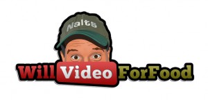
What do you think of the new logo? I’ve never really had a logo, unless you count the original one… me holding a piece of cardboard with Will Video For Food written poorly in marker.
This one cost me $5 on Fivver.com. I realize the banner above is kinda amateur and sparse, but that’s me on Photoshop (and Thesis is being a pain in the ass).


If you pass me the PSD I can fix the size and all that kind of jazz for ya.
I moderately like the new logo.
nice – the middle needs something
I like it!
YOU shut up. I liked the cardboard sign better.
It’s distinctive and nicely (literally) off-center, and the peeking Nalts always gets one’s attention. I think a bolder yellow than the dull greenish gold of “for food” would help to be more eye-catching.
Also, I can understand dividing it into left red “will video” and right gold “for food,” but the red “will” just disappears into the red “video” frame. The “will” should be the same color as the “for food.” It will make the most important word, “video,” stand out even more, with “VIDEO” and “will (what? –video) for food.”
For the block of text between the two logos, the blue is rather purplish, so the red needs to be brighter so that you have the necessary contrast both for distinctiveness and for people with mild vision impairments.
Yeah, what languageandhumor said.
It’s Awesome Dude!
Mazal Tov! It’s $5 well spent.
IMHO none of it matches, but the hues are the same and well, it kind of works.
🙂
@shiraabel
Agree with languageandhumor. make the “Will” Green” The green needs to be brightened up too.
BUt I would also liek to see another version with of this Where you head is enlarged so that the width of the head is the same as the Text. That would be good for the front of a TShirt.
It makes your butt look big.
Nice logo, but it need some dollar signs 😉
great logo but you might make the background of the word “video” a different color,jus sayin
It’s pretty good, I think.
Maby at http://youtubegeld.nl a nice Log finder at Youtbe!