YouTube is about one month into its most significant design change since launch: Cosmic Panda. I have a feeling I know where they got the “cosmic” and the panda.” Let’s look at the redesign, and overthink what it might tell us about YouTube strategy, and what I believe works and sucks (wins/fails).
As with other redesigns, hardcore YouTubers squealed and the rest of you probably didn’t even notice. We see that across the Interweb with any major design change by a social-media site or publisher. Unlike previous changes focused on the YouTube “homepage,” however, I believe the essence of this redesign (not having read any Google statements) is three-fold:
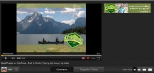
- Simplified video player: The new design creates what Philip Defranco legitimately calls a “Hulu grey” surrounding a very purist player. The majority of the information (date, comments, view count and related videos) are now almost lost”below the fold,” which has negative and positive implications.
- Preparing for TV/Web Marge: Cosmic Panda appears to be providing a “lean back” experience resembling television, but not too deeply at the expense of a “lean forward” user-driven video session characterized by searches, views of a channel page, comments, selection to view playlist, fast-forward-like options while we view “playlists.” Playlists, by the way, are assembled by creators or users, and are given far more emphasis in Cosmic Panda.
- Major Channel Page Changes: There’s been an odd disconnect between viewing a video on a “channel” page (created by a network, show, vlogger, artist or advertiser) and a regular view you’d experience by finding a video in the typical manner. And Cosmic Panda seems to be bringing these experiences (views on channe page vs. regular “watch” page) closer together. In reality, only a VERY small percent of views take place within a channel page. We advertiser and creators too often forget this. So it’s interesting that Cosmic Panda put so much effort into overhauling the creator “channel” pages. I gather these changes were made to accommodate the complex needs of networks and producers, but in reality the “branding” options have almost entirely vanished.
- Above all, the user comes first. Like Google, simplicity trumps advertisers and content creators.
- This design does suggest to me that YouTube wants to move toward web-TV. I could actually envision binging on YouTube content via my Google TV using this new design (something that was not as easy or fun in the previous one).
- Most importantly, I believe the emphasis on the channel page is the most telling. The channel pages are not frequented relative to views OFF channel, yet this is YouTube’s second major design release that fundamentally changes these channel pages. One could gather that YouTube sees value in these (or else they’d leave them alone, or give channel owners what they wanted). They didn’t. They reduced customization of the channel pages, and that’s consistant with previous reductions of channel owners (who once were permitted a small banner besides every video). So what’s the plan, Stan? Are we going to see a greater emphasis on channel/TV-like consumption instead of the graze & search model that predominates?
Reviews have been mixed but largely positive. ReelSEO digs it, and WillofDC is neutral to positive. Now before I critique it, let me acknowledge three indisputable truths:
- Change is inevitable.
- Change is usually painful in the long term, but beneficial in the long term.
- Change by heavy users of a site is almost always bad (as the VidCon satire with YouTube PD Brian Glick’s shows).

And before I pick my “wins” and “fails,” let me acknowledge the “hats” I can and can’t wear while critiquing it:
- As a 10-year veteren of online marketing and advertising (mostly client side, but also agency) I have some strong POV from a brand/commercial perspective.
- As a creator with 1000 plus videos seen 250 million times, I have pretty strong feelings.
- Finally, as a YouTube extreme “user,” I spend a lot of time on the site (although less in the past year). So I can adjust to design quirks that would send my mom into a tailspin.
- BUT What I CAN’T speak to is what “normal” mainstream viewers feel about the site. I can only hope YouTube recognized that segment as the primary audience for the redesign, and not hard-core users, creators or advertisers.
An important internet meme is “win and fail.” Popularized by Fail Blog, this refers to victories and public mistakes — usually involving someone getting hurt or doing something worthy of a Darwin award (yes they’re still around). Let’s talk wins and fails of Cosmic Panda.
Biggest Fails
a) Where’s the Creator/Brand Love? The channel page provides reduced customization, and as a creator and marketer (who has worked on brand channels) I’m not digging that. However I do respect that simplicity is good, I resent the limited customization and the horrific minimization of everything “below the fold” (seen without scrolling on most browsers).
b) Wasted Space… New Ads? Biggest fail, which will certainly be remedied, is this horrific waste of precious “above the fold.” I want IAB standards on rich-media ads that can play here. As a viewer, I would hope the advertiser pays more for annoying/busy ads (or I’ll get out my post-it notes and cover the space). But as an advertiser I like the idea that we can use this area to serve ads that are typical online… instead of just annoying prerolls and forgotten banners.

c) Form Over Function: Simplicity triumphed at the expense of some important basics. I need to scroll to see the date of the video! Comments are tucked away in a separate part of the experience, which is fair since most don’t read or write comment. However it’s going to reduce engagement. Furthermore, I was saddened to see how little “love” the related videos get. This is a very important way for a viewer to find content, and a very valuable way for a creator to engage a viewer in a binge. I used Cosmic Panda for weeks before I even noticed these three choices. I don’t think my mom will notice them anymore than the previous convoluted mess that allowed you to sort videos by views, date and ratings.

Bigs Wins
a) Simpler, Polished User Experience: Panda’s biggest victory is the simplicity and emphasis on the video being viewed… downplaying comments and ratings, and making it easy to toggle to a full-screen view. That’s important in the migration ahead (webTV). We humans have executive brains that ask for loads of functionality, but our limbic systems want fewer choices and eyeball competition.
b) Channel Emphasis: I do fundamentally like the focus on “channels” because I think it’s a deeply engrained mode for us based on television. I was pleased to see how far down you’d have to scroll to get to a “related” video by another creator. Let’s use a TV mindset to predict the future. I find US Network the best at cross-promotion of shows, and now find myself plunging deeper and deeper into its “characters welcome” family of shows. YouTube’s new approach facilitates that type of relationship between a creator/network and its audience. It’s easy to find playlists and view them consecutively with a wonderful thumbnail slider. It’s increasingly rare to binge on a string of videos that other users have found related… although I confess a guilty pleasure of occasionally getting on a binge of a specific topic (usually pets, pranks, babies laughing). In general most of us a) chronically view a creator, b) search out videos, or count on others to help us mine for gold in a river of dung.
c) Mama Might Understand It: While I’m not crazy about the featured/videos/community tab, I do think the channel page is MUCH better at helping my mom find my most recent videos (I used a custom URL to provide that previously), and for friends/colleagues to find specific playlists. The reason that’s so important is that viewers don’t want a lot of choices… they want to either see the most recent video (“new” is almost always preferred to “good” in most mediums), or they want a specific, consistent genre of videos. I’ve always had trouble keeping various audiences pleased: My fart viewers don’t care about my family videos, and my fellow parents may not be interested in sophomoric pranks… they just want to see the family. The relationship between the audience and the creator/network needs to acknowledge that diversity, and Panda is a huge step forward on that important dimension.
AHEAD: The next step is pivotal. We need to see YouTube drive traffic more seamlessly to these channels from the videos that comprise them. It’s far from intuitive, for instance, to move from watching “Farting in Public” to my channel page (subtle icon on bottom) and then subscribe (the button has been muted from its earlier orange). Emphasis on that path (from viewer to subscriber) will help turn grazers into loyal YouTube channel viewers, thus significantly increasing YouTube’s views, average sessions, and advertising revenue. Then YouTube will have to figure out how to let subscribers to a channel “sub” subscribe to specific shows/type of content. That’s not an easy one. But I think Google can figure it out.
What do you think? Did you even read this 1500 word doctrine? Me neither.

long article, nalts
I tried it, and I can’t stand it. I’m pretty open to new features and whatever youtube is always throwing at us, but this Cosmic Panda is about to kill off tens of thousands of “Community Users” if you still consider youtube a community. I understand Google is trying really hard to push into the TV market, but my content is totally NOT TV worthy nor have I ever thought to have my videos on TV, so why push a user into a profile that would just make me upset to even use Youtube as a video platform. Oh one other point, Youtube needs to get one thing straight and working before launching something new, everybody that uses youtube knows the reliability factor is dropping everyday and then your going to push this through and think nothing is going to go wrong? C’mon man, they can’t even get annotations rights anymore?
Well I’m done ranting, and I hope you all have a nice day.
Peace, Ace77man
“the reliability factor is dropping everyday”….yup it sure is,what are they gonna do next? Take away the search box?
Kevin,
If you read the information on Cosmic Panda in the Partner Hub. Branding options will be coming THE LOVE. Right now YouTube is concentrating on the viewing experience.
“Change is usually painful in the long term, but beneficial in the long term.” Did you mean that change is usually painful in the SHORT term? Also, sorry to burst your bubble, Kev, but Mama ain’t never gonna understand how to find your videos.
When I first switched to Cosmic Panda, I didn’t like it. My normal navigation was gone and my usual pattern of browsing videos was different. But after sticking with it for a couple weeks, I actually like it better than the old design. I had some trouble with my “watch later” playlist, which YouTube promptly fixed after me (and undoubtedly many other people) submitted feedback about it. It’s still missing some features (like posting a video response), but I’m sure it’ll come.
My thoughts:
I’m a bit apprehensive about the Hulu like appearance. I’ve always thought YouTube would help revolutionize online video so on I guess on some asthetic level, this design choice doesn’t sit well with me.
I have a different theory of the average user. The average user doesn’t even log in. They search and find, watch and close the window. Maybe something in the related videos section calls their attention and they click on it and watch that too. Being “lost below the field” will lessen this.
I don’t lament the reduction of customization, mostly because I’ve seen people execute it poorly (myself included).
I used to dislike change until I realized if things stay the same they become stagnant and trivial. This is especially so in the internet. No one wants to become another Myspace story.
I agree with your view about the dead space “above the fold”. I hope the advertisers use it wisely.
I’ve never been a fan of ratings, if YouTube were to use another site’s design idea. It would be the Facebook “Like” button. There is no “Not like” button (and I hope there never will be) .
I actually like the Featured/Videos/Community tabs though, I personally like to be able to see how specific YouTubers interact with others.
I’m curious, to see if with Cosmic Panda will make playlists be more instrumental to content creators. What do you think?
My mamma can’t figure it out.
it’s slick – buttons are too fat – but I just found out I have subscribers on a channel that has no videos – who knew!
takes too long to load, it’s bulky, lost featured video, have to rearrange all my stuff now.
meh, it’s nice if you have a stated purpose, but the thumbnails are too big for some of the people I sub to.
It’s definitely geared towards a TV style.
I’m happy with the old format – but on some of my channels it might work well – it’s just not informative.
I agree with phil.
Why doesn’t google just buy hulu and leave youtube simple and alone.
I started using Vimeo for projects. There’s a warmer community feel there – blip is too cold and Revver – what happen to revver? anyone? and youtube keeps messing around and giving people grief.
If they put as much energy into making people feel welcomed that they put into screwing things up and trying to please advertises – which the current model is going the way of the dinosaur – they’d have something nice and really worthwhile.
This corporate model has to change. You Tube need to fix their reputation first, but like the IRS, no small task.
Post-it notes… lol. That’s adorable.
Well I guess things have to change, evolve and what else. I can already ear the choir of people moaning and bitching about it. I don’t really like it as it is now, mostly ’cause I have to get used to it.
I can see as well pros and cons of the new design and I’m with Al, I believe playlists will become more important over time.
I’m really curious to see how other content creators will deal with it, I have no idea how I will, yet.
Thinking a bit more about this. As content creators we might have to become a bit more savvy and incorporate bumpers with “previous” and “next” video annotations as others do. Also as much as I dislike it, we might be hearing a lot more “please subscribe” in videos.
I love Cosmic Panda. Sure there are bugs, but that is true with anything beta. Everything Google does is awesome, and Cosmic Panda can only help both the creator and the viewer experience. Thank you Google for the gifts you bring. Thank you for Google+, thank you for Cosmic Panda. Thank you Nalts for creating Google.
PigNoseCharlie
Al- I hope we don’t end up having to create navigation using annotations- seems like an obvious add-on. SIGH- not seeing the upside at the moment, and I’mr eally annoyed a work-related site has to change its ui before launch to match cosmic. 🙁
Nalts Id watch you if they use Cosmic Panda or even the more sucessfull Sneezing Panda.
I like how you can easily arrange and organize your videos into categories with cosmic panda. I honestly think cosmic panda kicks ass. It seems to lag sometimes though. That’s probably the only complaint I have with it. Also, I like how when you comment, you have your channel picture beside it as opposed to just the name of your channel. That kicks ass too.
Oh yea, whats up with the no video response thing? Are they getting rid of that or is it a problem that youtube hasn’t gotten around to fixing yet? Seems like someone should get on that.
@Al and Nalts. I thought annotation bumpers were quite a standard already. Any particular reason why you guys don’t like it?
@Erik idk, just never really liked them, I just have to chalk it up to “Get over it and embrace it.”
@ErikRVA I just think annotation bumpers might ought to be automatic/optional instead of custom made (given how common they are). @King Bong the downplay of video responses was a real assault on the interaction/community thing. That used to be fun.
Do you think they want to get rid of video responses/interaction all together? I really hope not.
You should have come to Vidcon Nalts, the Cosmic Panda panel was very informative. The Product Manager for Channels and the Engineer responsible for the redesign were there presenting.
@Nalts good call, that could be time saving. I would also leave the customisation option though, still helpful sometimes.
@Matt any news about future developments?