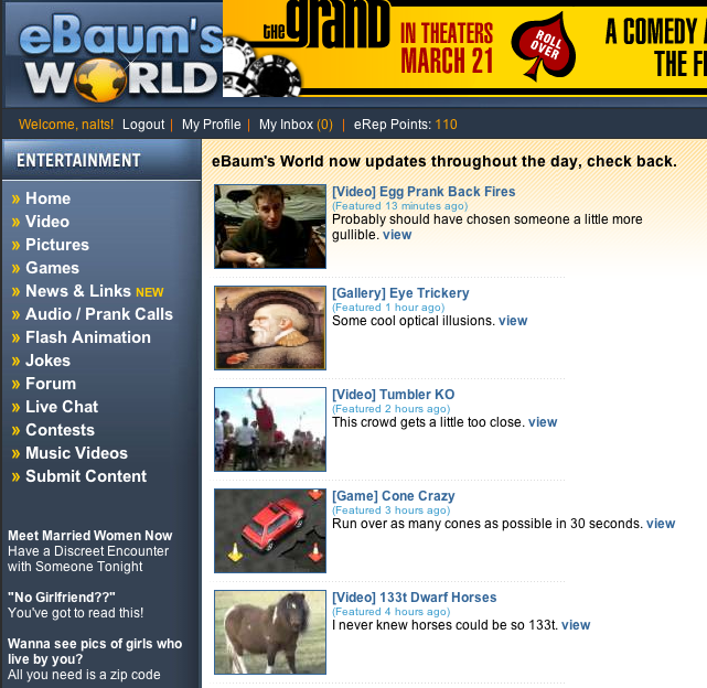
 New YouTube design. Whatya think? Nothing on the YouTube blog about it yet, and I’m not seeing any major functionality changes other than:
- A bit different way to toggle between comments and stats (honors)
- A better advanced search user experience
What am I missing? I really wish they would have replaced the YouTube messaging with gmail…

I hate it.
It’s way too busy and a bit confusing….
It’s too hard to tell what’s a comment and what’s a reply.
I don’t like most of it. I don’t like they changed the honors.
The only thing I like is the enhanced social networking links.
I haven’t tried to search yet. I hope its somewhat decent.
They really should intergrate gmail already.
We have been having Internet problems at work today and I can’t ever get on YT at work abyway, but today I couldn’t even get my daily fix of this blog until now. I really need a life.
PS-I’ll check out the site when I get home; or at least, after our special teachers’ “meeting” this afternoon (Spring break starts tomorrow!)
I hate it!
On every channel, a lot of the text has been replaced by black. It totally ruins the channel design.
I lost a bunch of comments yesterday just so they could make these cosmetic changes!? GROAN. I’m so tired of the younger generation thinking cosmetics = performance. And the “enhanced social networking” doesn’t work as well from Youtube as it does on the sites I’ve been using to post, blog and bookmark my Youtube videos, Leon, so all in all, it’s another wash.
And the video transcoding still sucks.
they gave the boot to honors, just as soon as I was actually starting to get some.
wow, Mike Gravel apparently feels strongly about his dislike of the new design!
I wrote a little about my gripes in the willvideoforfood forum: http://willvideoforfood.com/forum/showthread.php?t=142
Basically I like the menus, but hate how they took the times off the site. In subscriptions, and video lists you no longer know how long ago the video as made…
FIX THE MESSAGES! just transfer them all to google accounts – easy smeasey
I think the design looks fat, reminds me of windows 3.1
yo YT! streamlined to at least XP, or give the option
Ultimately, I think all the new switches are to discourage community – YT scatters all to the wind and puts us in charge of advertising.
The evidence we needed to prove that YouTube employees shop at Ikea, surely?! lol
hey YouTubeCNN is now live anywhere.
We Won!
What is YouTubeCNN?
F youtube!!
What changes, there were some? i’ve been watching the swift kid ads
http://www.cnn.com/video/#/video/politics/2008/04/11/sot.clinton.laughs.off.pool
Look for the video titled pint sized parodies. or 23/6 parodies website
or just go here and watch the swiftkids ads http://www.236.com/video/?bcpid=1272014315&bclid=1418511762&bctid=1443772514
I like the changes.